
JEMA AI Chat Design Pattern
Increasing engagement with the ai chat agent through a new global chat pattern.

JEMA is an ai career companion that moves with you through your career. Jema provides personalized career guidance, resume support and job matching based on your strengths, values, and working style.
As I was working on the Pathways feature, I found that the chat experience was an afterthought for users. JEMA, the ai companion was intended to be central to the product experience. After talking to product, I learned this was happening across the product suite.
Researching patterns
I started researching common patterns for effective placement of the chat window. Our current location was on the right of the screen. That pattern is good for chat as a secondary support to an action. Some tools also use a hovering chat experience. I decided on having chat on the left and always visible on the page. This puts the interaction where users look first.
I recommended other additions to the chat experience to increase engagement. First, I introduced multi-select suggestions within the chat. This gives the user a quick way to enter common responses. Second, I suggested text with recommendations for what you can ask the chat agent. Recommendations help the user know what they can say to the agent. This is especially helpful for users that are new to interacting with an ai chat agent. I met with product and we decided to incorporate the multi-select suggestions in the first release.
Design pattern page layout updates
Moving chat to the left meant updating the page layout interaction design and visual design. The layout was updated across the 3 main of page templates and across all 8 live product prisms (sections). For the visual design, we introduced a 30% gradient over the background. This made the column stand out from the page. It was lighter than the navigation bar and darker then the rest of the page. The gradient kept the bright feel of the page, which changed with each product area, while keeping the consistency across areas.
Additional updates to the chat design patterns
These changes introduced the multiple new elements to the chat experience. I made a number of updates to chat elements.
- I designed multi-select options within the chat bubble.
- I added suggestions for ways the user can continue the conversation with the chat agent.
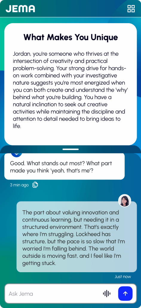
- I updated the width of the chat bubbles to further distinguish user chat from the agent chat. This was intended to solve a problem we heard in user conversations. I added padding on the right of JEMA chat and on the left of user chat to make it easier to see which user is chatting. I also changed the background of user chat to have a 70% transparent white background to further distinguish it from the JEMA chat. This gave the user chat a different background color from JEMA chat, while also complimenting the colored background that identified the current product. of the current product.
I received approval from executives to include the multi-select options and the updates to distinguish the chat conversations. The suggestions were put on the backlog. The prioritized updates implemented and released in the weeks following the completion of my work.
Dimensions page launched with new design using the design system

Insights page launched with new design using the design system

Samples from the JEMA ai chat design patterns
The following content shows the elements created to product the chat elements.
Chat input for desktop and mobile devices

Select item for a multi-select response

The chat footer includes 4 variations
- default footer with copy option
- recent response from the ai chat bot with the copy option plus a thumbs up or down allowing the user to respond to the quality of the JEMA content
- timestamp only for content that does not need copied, usually a greeting or initial prompt for the user
- user chat footer with only a timestamp

The chat bubble patterns are shown below. 5 variations are shown and descriptions are top down in the left column, then moving to the right.
- default chat response
- JEMA is responding (in progress)
- response that includes an image, usually used to direct the user to a Prism or area of the product
- multi-select response
- user chat

Assembling these elements
The desktop chat container pattern is always open on the page. Chat bubbles are centered. The two screens below represent a new chat and a chat conversation.
Note: long chat conversations disappear off the page and can be reviewed by scrolling up. We also included an up arrow in these scenarios

The mobile chat container resizes unlike the desktop container. The three variations below
- collapsed, not in use and ready for a prompt
- dragged small to focus on something else on the page, available to reopen anytime
- standard state when in a conversation, 50% of the screen by default and can be dragged larger and smaller
